Explore More Projects
SERVICES
UX Design
Research
Wireframing
Design System
Prototyping
TEAM
Product, Engineering, Content & Design
MY ROLL
UX Designer
DURATION
6-8 Months (2024)
DESCRIPTION
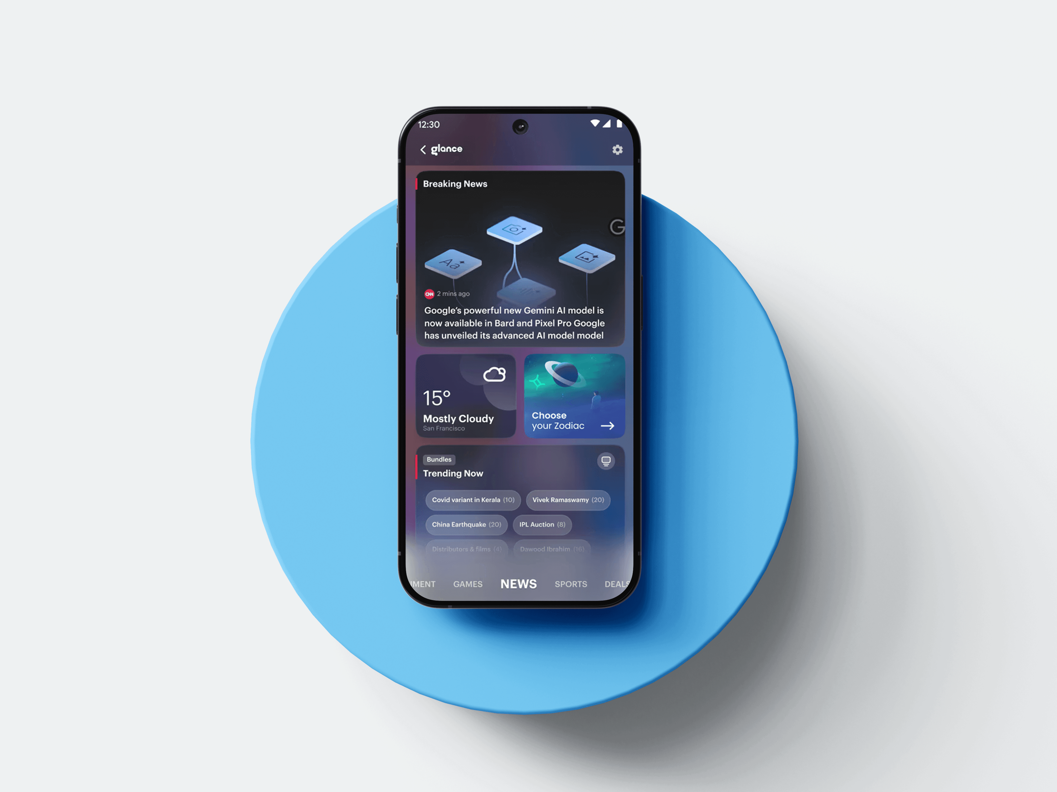
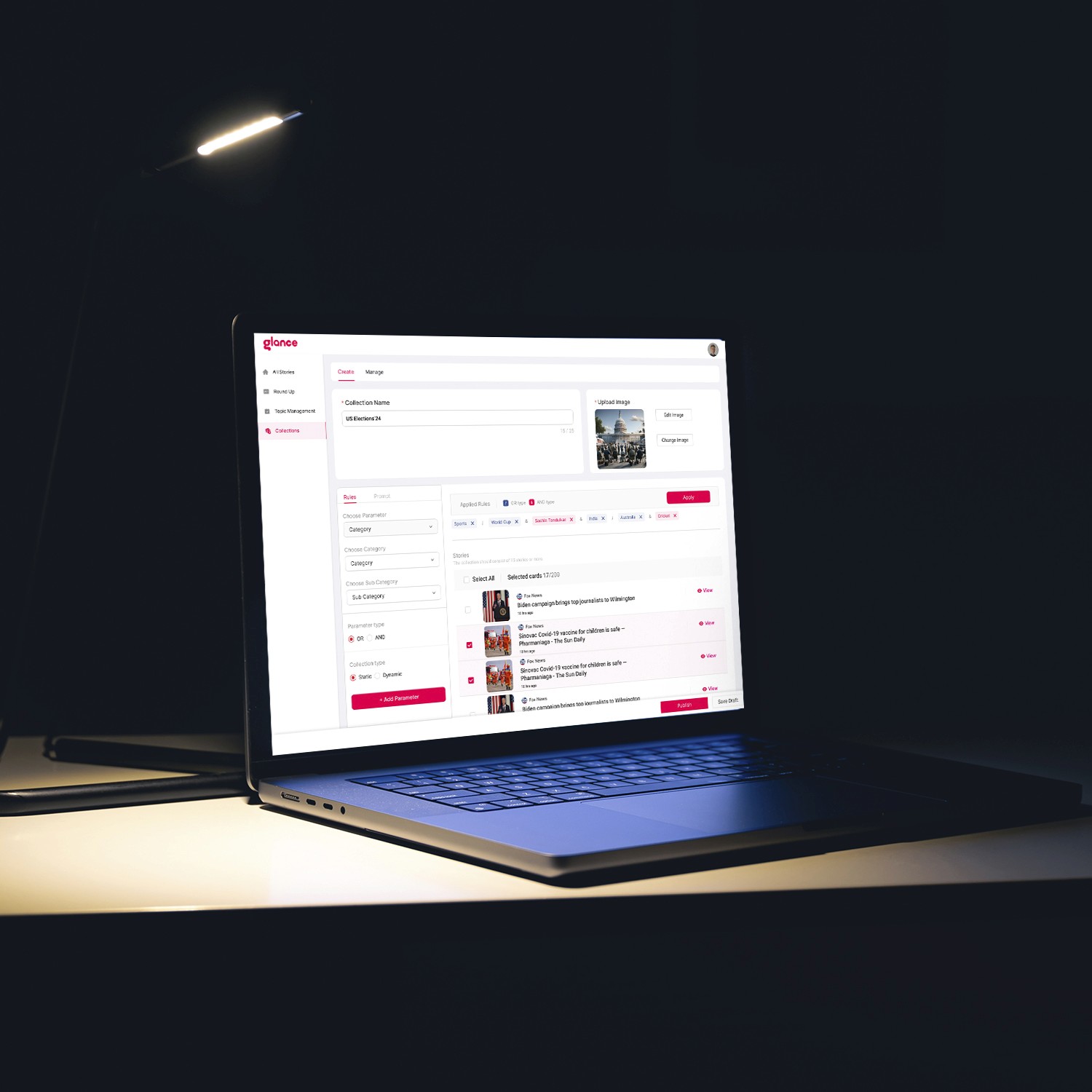
Unified Fast Cards (UFC):
A scalable card framework for creating consistent content experiences across the Glance ecosystem.
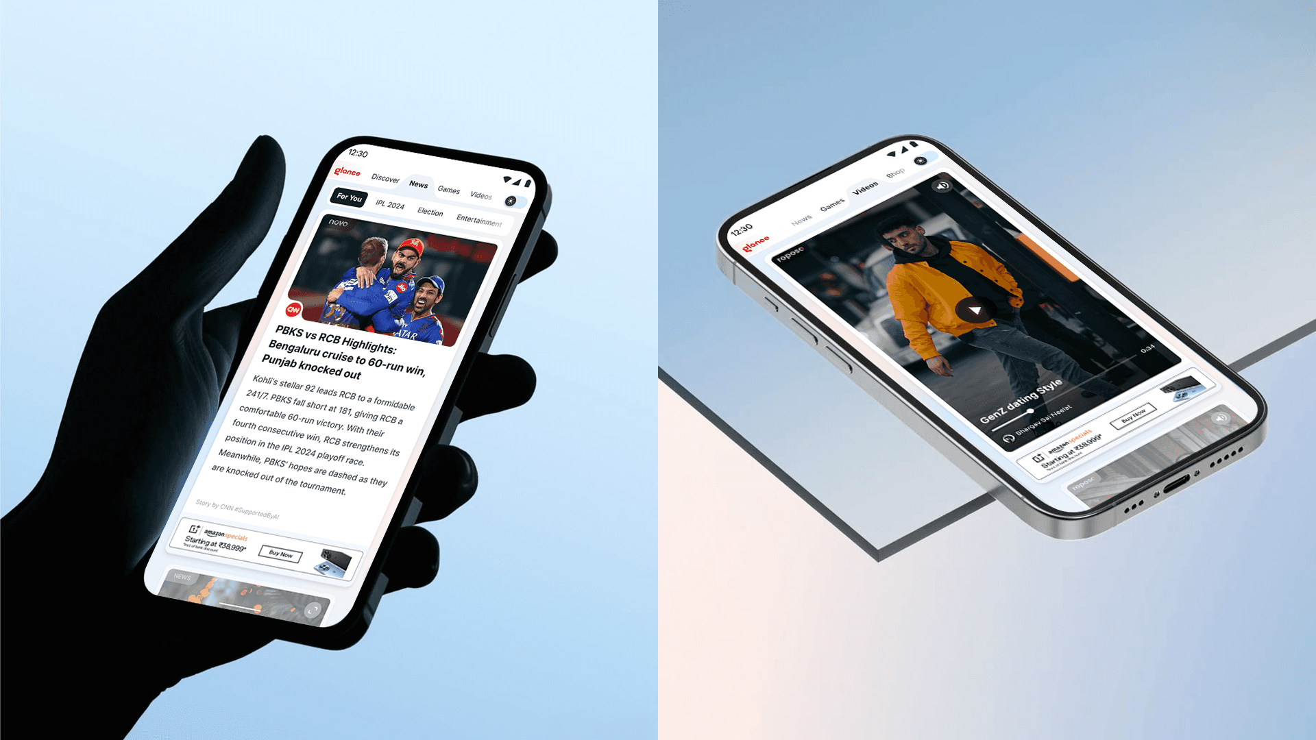
As Glance expanded across News, Videos, Games, and Shopping, each product evolved independently, resulting in inconsistent card patterns and fragmented user experiences. At the same time, most OEM partners didn't support native navigation tabs, making it difficult to deliver a consistent browsing experience across devices. We needed a unified, Tabless-first framework that could scale across products and adapt to different OEM capabilities without maintaining separate design systems.
Product Audit
Reviewed card patterns across News, Videos, Games & Shopping
Design Audit
Layouts
Typography
Spacing
Interactions
Engineering Feedback
Duplicate implementations
Fragmented components
High maintenance effort
User Behaviour
Scanning patterns
Recognition
Content discovery
Cross-product consistency
Create one design language across products.
Tabless-first across OEMs
Most OEM partners relied on Tabless experiences, while others supported Hybrid or Native navigation. The framework needed to work seamlessly across all three.
Tabless was the primary design target because it covered the majority of OEM deployments.

Content discoverability
Help users scan and engage with relevant content faster.
Scalability
Build once and reuse across products, OEMs, and future experiences.
Performance
Keep the UI lightweight for web-rendered surfaces.
Create one consistent card system across products.
Improve content discoverability.
Support multilingual content.
Work across Tabless, Hybrid and Native OEM experiences.
Reduce component duplication.
Scale to future content types while maintaining lightweight performance.

Building a Unified Design Language
Building one consistent design language
Standardized colors, typography, spacing, corner radius, and elevation using design tokens.
Built reusable components for navigation, cards, CTAs, and interactions.
Unified visual and interaction patterns across News, Games, Videos, and Shopping.
Established a shared design system that improved collaboration between design and engineering.
Impact
Consistent experience across all products.
Faster implementation through reusable components.
Easier maintenance and future scalability.


Solving Content Discoverability
Making content easier to discover
Introduced platform-level (primary) navigation to enable seamless movement across News, Games, Videos, and Shopping.
Designed contextual (secondary) navigation to surface relevant categories within each product.
Improved information hierarchy through consistent layouts, typography, and spacing for faster content scanning.
Standardized reusable card patterns to create a familiar browsing experience across the platform.
Impact
Easier content discovery.
Faster scanning and recognition.
Consistent experience across News, Games, Videos & Shopping.




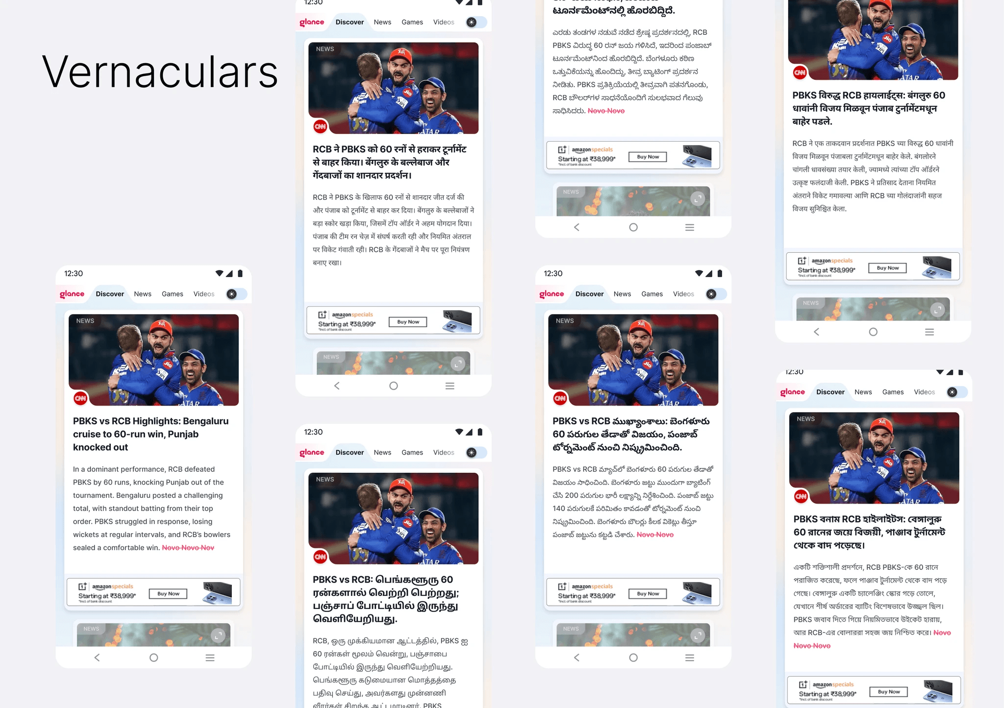
Designing for Multilingual Content
Making Glance more accessible for users across Tier 2 and Tier 3 cities, where regional languages are the primary mode of content consumption.
Expanded content support across Hindi, Tamil, Telugu, Kannada, Bengali, and Marathi.
Designed flexible layouts that adapt to varying text lengths without breaking hierarchy or readability.
Maintained a consistent browsing experience across English and vernacular content.
Impact
Increased accessibility for regional audiences.
Improved readability across multiple languages.
Delivered a consistent experience regardless of language.
Exploring the Self-Hosted Article Experience
As part of UFC, we also reimagined the self-hosted article experience to better support different reading behaviors. We explored three variants focused on quick consumption, immersive reading, and lightweight performance while maintaining a consistent design language.
SHP Summary
Quick-read experience
Three-point summary for users who prefer bite-sized content.
Faster understanding with minimal scrolling.
SHP Standard
Complete article experience
Full-length article for deeper engagement.
Optimized typography and reading hierarchy.
SHP Lite
Lightweight experience
Removed hero imagery for faster loading.
Introduced a contextual Glance widget to surface additional content and encourage exploration.


Reduced friction through a cleaner, more intuitive content experience.
Improved discoverability encouraged users to explore more frequently.
Content Consumption
Optimized card hierarchy made content easier to scan and engage with.
Return Rate
Consistent interactions built familiarity and encouraged repeat usage.
DEU Adoption
A modular, reusable framework accelerated adoption across products and OEM partners.
Throughout the project, I learned to:
Balance user needs, business goals, and engineering constraints when making design decisions.
Think beyond individual screens and design for reusable systems that scale.
Use data, user behavior, and stakeholder feedback to validate design decisions.
Create patterns that remain consistent while adapting to different products, OEMs, and languages.